Initial objective
Investigate and reduce product churn.
Outcome
Increased the success rate of new users completing their core job-to-be-done by 50%, reduce task time by 50%, and a monetization strategy that’s generating over $40,000 monthly. Reversed churn trend.
Timeline
8 weeks
My role
Lead Product Designer
Key collaborators
Product manager | Lead developer | Sales and support teams | Vendasta customers
Deliverables
Interactive hi-fid prototype | User testing report | Confluence documentation
Key tools
Figma | Confluence | Google Surveys
Design System
Galaxy (adherence and contribution)
Image — Open license: Vendasta. Copyright terms and license: Public Domain.
Vendasta | Serving agencies with SAAS solutions
Vendasta specializes in providing comprehensive solutions tailored to meeting the digital marketing needs of small businesses.
These solutions are not sold directly to small businesses however, instead Vendasta provides these tools to agencies who then resell them as part of their own white-label SASS offering.
Listing Builder | A foundational solution
The core functionality of Listing builder is a synchronization feature, which enables businesses to manage their online data centrally.
By automatically disseminating information to directories, social media platforms, search engines, and emerging technologies such as voice assistants, Listing Builder significantly boosts a business's search engine optimization (SEO) potential.
When I joined, the initial issue at hand was high churn as the result of an increasingly diminishing retention window.
Quantitative data about this product also indicated a large cohort of customers trying the free version once and never returning.
At that time there was an focus on making our existing syncing service more robust. Was this really the root problem?
Image — Open license: Unsplash. Copyright terms and license: Public Domain.
1 | Internal knowledge audit
Go at it alone? Never.
I teamed up with the Product Manager. Together we engaged with sales and support staff to learn more.
At this point our focus was learning as much as possible, exploring horizontally, and keeping an open mind.
Image — Copyright holder: Vendasta. Copyright terms and license: Private Domain. Design process.
2 | Baseline usability testing
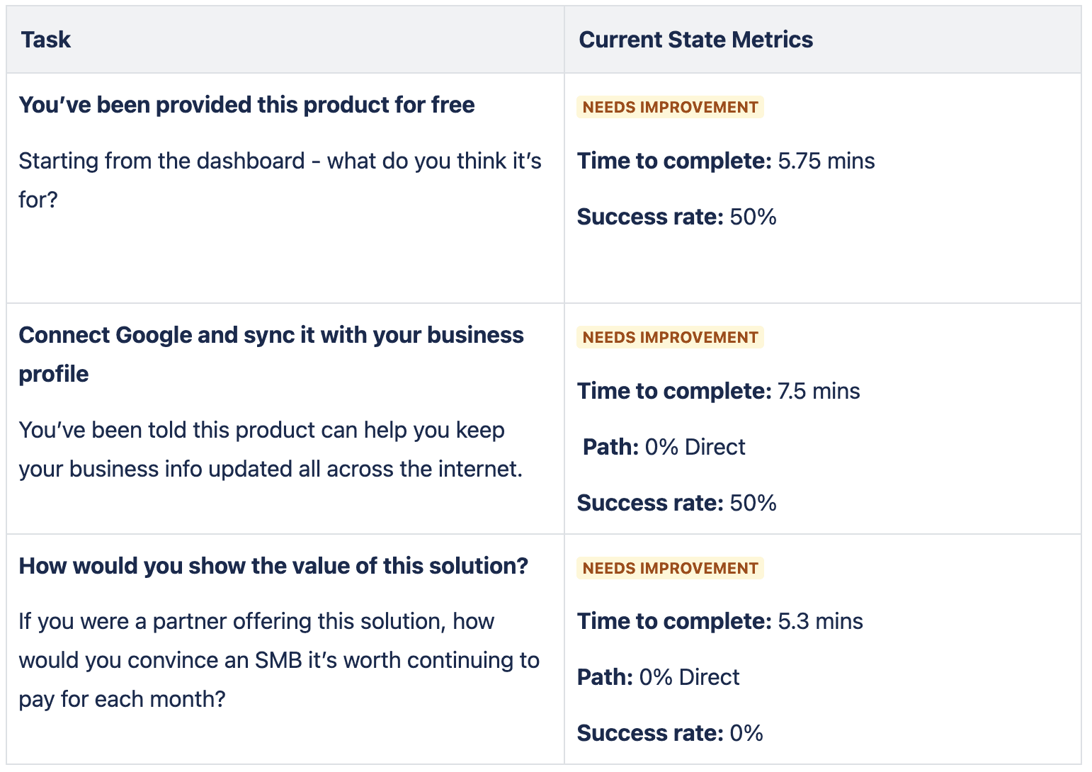
To better understand where our existing workflow and UI failed new users I made some first-hand observations.
I put together a fake small business called Whiskers Cat Cafe and used it to test the existing interface with new users. Core Job to be Done completion and product comprehension were evaluated.
Image — Copyright holder: Vendasta. Copyright terms and license: Private Domain. Design process.
3 | Competitor analysis
I took a deep dive into the competitor arena. This was helpful for two reasons:
Firstly, it helped to identity existing design patterns common in the industry (see Jakob's Law). Secondly, it validated what we had been hearing from internal and external stakeholders.
Image — Copyright holder: Vendasta. Copyright terms and license: Private Domain. Competitor matrix.
4 | Customer interviews & survey
In order to better understand and validate our customers' needs and pain points, we needed to talk to them.
In doing so we were able to gain valuable insight into the challenges they were facing when it came to providing the tool to their SMB clients.
Image — Open license: Unsplash. Copyright terms and license: Public Domain. Customer interview
1
Lacking proof of value
Proving the value of Listing Builder toward an SMBs larger SEO strategy was a big challenge for our customers. Half of existing customers surveyed were paying for another tool to complete this task.
2
Poor usability for new users
50% of new users tested couldn't derive the product purpose on their own. Of those who did understand the value prop a further 50% failed to complete the core task of syncing their first online listing.
3
"Dusty" visual styling
Visually dated solutions erode user confidence. See, the aesthetic-usability effect - users perceive aesthetic products as more usable and valuable. Product was noted as feeling dated and uninspired.
Team solution exploration workshop
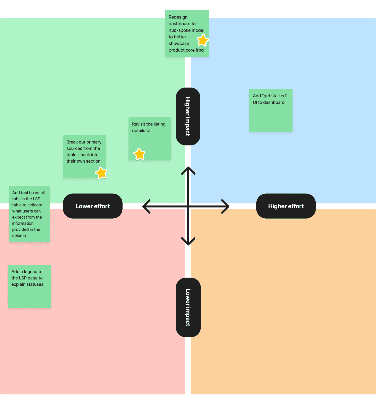
It can be tempting to jump straight to high-fidelity prototyping at this point, but arrival at the best solution often benefits from another phase of open-minded exploration where many ideas are considered.
This phase included running a workshop with the cross functional team to ideate together. Collaborating with the team not only helps us generate more ideas, it also ensures we have a solid understanding of how costly certain ideas might be from a feasibility perspective.
Image — Copyright holder: Vendasta. Copyright terms and license: Private Domain. Effort impact matrix.
Image — Copyright holder: Vendasta. Copyright terms and license: Private Domain. Effort impact matrix.
I didn't get it all right the first time, but I learned a lot
The first iteration will always be the most assumption rich, and this project was no exception. One of the design changes made to the core workflow reduced success rate and increased time to complete. Yikes? Not really, because none of our customers ever saw this version. This is the massive value of beginning with a baseline usability analysis which iterations can be measured against to prove their efficacy. For every iteration we ran a small battery of usability tests.
Onward and upward - the journey to the final version
Rapid prototyping and testing meant I was never working in the dark. Armed with the knowledge of my first attempt I went back to the drawing board.
I knew we had struck gold when we started seeing a stark improvement against our baseline measures.
Below are the aggregate results for the solution we implemented.
Image — Copyright holder: Vendasta. Copyright terms and license: Private Domain. Usability Tests Summary
Working with the cross functional team to iteratively deliver value
I wrapped up my solution crafting just as the team was ready to start delivering. Of course we didn't deliver everything all at once, but because I had been closely working with the dev team from the beginning of our exploration phase we already had a good handle on the effort required to bring our solution over the line.
So, what did we deliver?
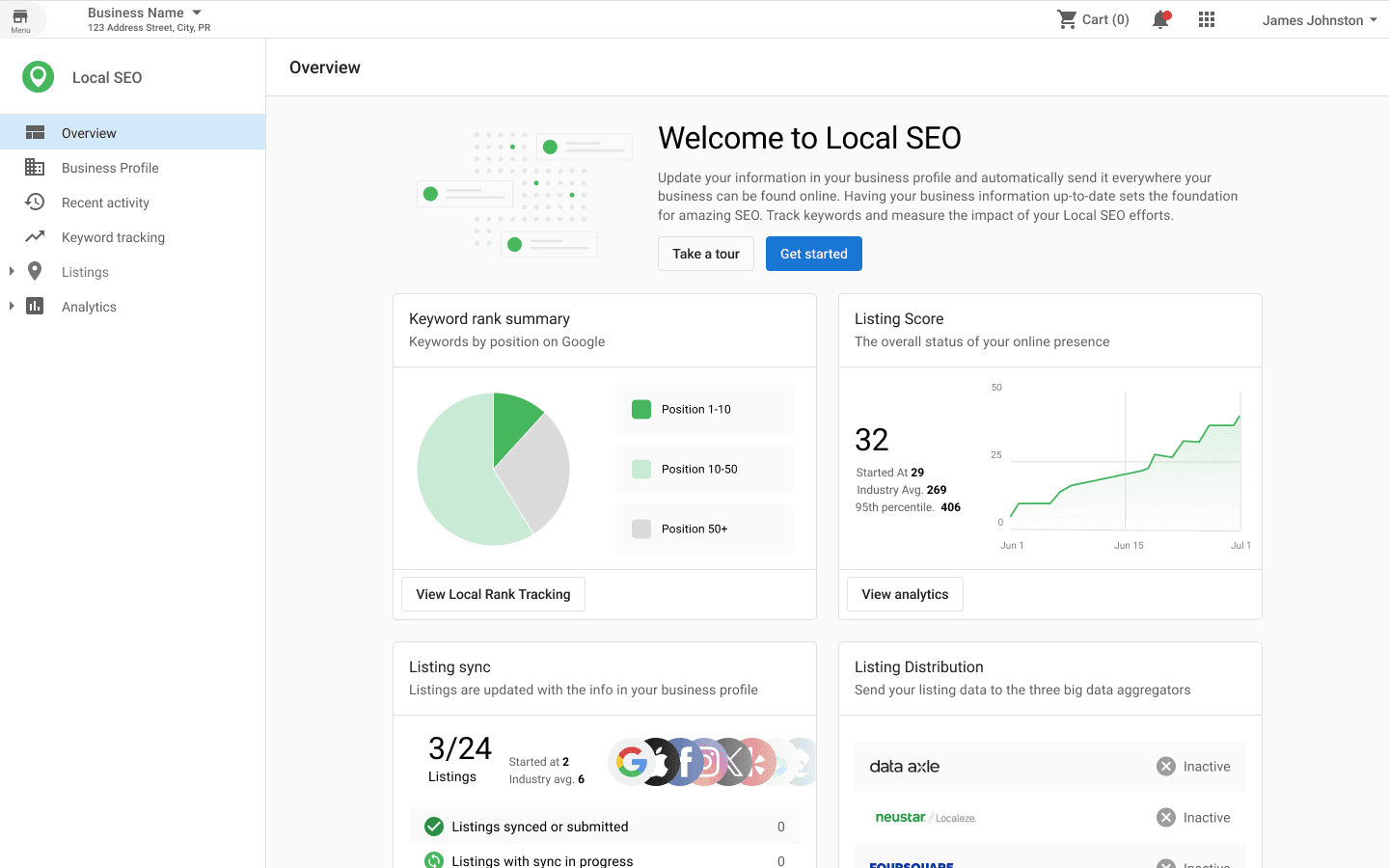
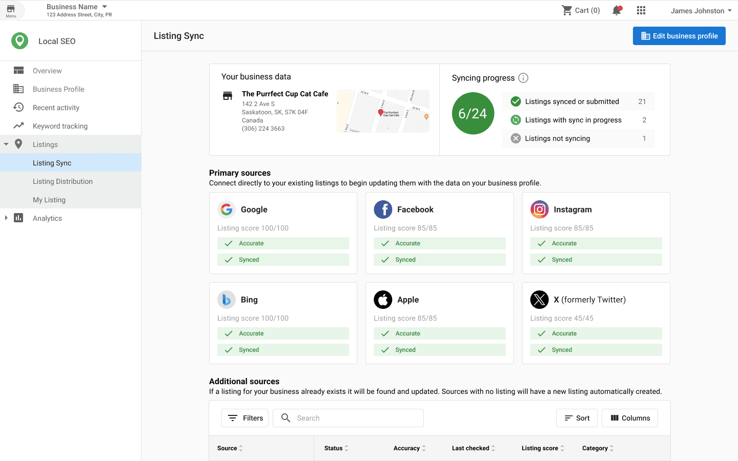
The final solution married a battery of visual design, information architecture, and workflow updates together with a new feature release - keyword tracking. Working with product and marketing team-members we decided to roll these updates into a product re-brand that better suited where we had discovered the industry was going. With a few weeks of development "Listing Builder" was replaced with the newly dubbed "Local SEO."
Image — Copyright holder: Vendasta. Copyright terms and license: Public Domain. Product Images
Measuring success
Understanding the impact of a project isn't a one-time task, multiple approaches often offer the best level of clarity:
Leading Metrics: The previously mentioned usability test results helped us to validate the design early (pre-release), another tactic that helped here was engaging our customers for feedback - listening and iterating with them.
Middling Metrics: Shortly after release we were able to bolster our leading indicators with real-time data thanks to a tool called PostHog. We were pleased to see that the results we observed in our battery of usability tests (task completion rates, time to complete) were also reflected in the real user data. We also had access to recordings of real user sessions which we observed to inform our next iterations.
Lagging Metrics: Lastly, we have metrics such as churn and revenue generation; both of these measures helped to validate the value of this work with revenue currently sitting at over $360,000 and churn for the new release sitting far below our original value for the freemium Listing Builder.
In retrospective
This project taught me a lot, here are a few of my key takeaways:
Don't skip out on discovery - Discovery is the foundation that this project stands on. Understanding the existing customer experience, competitive landscape, and leveraging data we already had was what "turned on the lights" for us as a team.
Stay agile - Research doesn't have to be a monumental effort, nor does getting a first slice of design in front of customers. By working fast and iterating often we were able to keep the momentum and velocity of the project high.
Work cross-functionally - I worked very closely with my product manager and lead dev on this project. We say on customer calls together, discussed implementation effort, business value, etc. Don't work in a siloh. Sharing an understanding means we we're always in lock-step as a team.
Build with your customers - "It really felt like we built the solution with the team, can we be involved in more work like this?" a partner exclaimed on a recent sales call. Building with our customers means we're collaborating to unfold the best solution together and makes everything so much smoother.
What's next?
No project is every fully "done" - I can't share everything we're doing, but here are some high level themes:
Measuring, watching, learning, iterating - The evaluation never stops, while we're happy with the results we achieved, I'm excitedly watching and learning how we can further iterate to generate additional customer and business value.
Keeping up with our customers - We continue to talk with our customers regularly, and add more new customers to this group.


